Casa Antiqua gets a new logo
A cozy little hotel from the medieval center of Brașov, Romania decided it’s time for a slight rebrand. Casa Antiqua contacted me the other day and asked if we could develop a more locally and historically relevant logo.
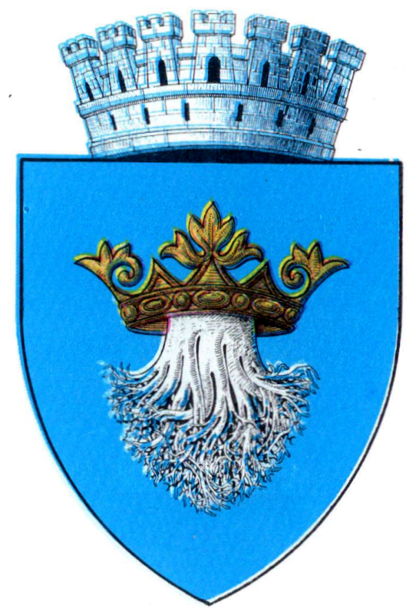
The starting idea of the logo was to play off the old Brașov’s coat of arms: the tree trunk & roots “wearing” a crown – hence the German name “Kronstadt”.
We wanted to stylize it and modernize it a bit, but still keep a certain “antique” feeling about it.
The upper part of the logo, the crown doubles as the top side and headboard of a bed, with two pillows. This way, it hints both to Kronstadt and the fact that it is a place to rest.
I shaded the tree trunk on the right side to give it a more cylindrical/volumetric look, and turned the roots into medieval swooshes and embellishments.
The separator line also has two different functions: firstly, it graphically divides the root from tree trunk, further explaining what the element symbolizes – it looks like that’s the earth level or horizon.
Secondly, without this, the white space under the word mark on the left and right of the tree trunk was too vast, and it made the trunk, the word mark and the crown/bed look like three separate individual elements, rather than one single homogeneous logo.

The word mark is kept relatively simple – A small caps serif font. We thought about some Gothic lettering, but that always ended up looking way too crowded and heavy. So we kept with something more minimalist to let the rest of the elements stand out a bit louder.
I’ll post an update in this blog entry, as soon as they change the Hotel facade with the new logo.
